THE GOAL IS UX
The idea behind offering clean design is for a better user experience for your customer
To The Point
You have a lot to say to your customers, so it’s difficult to pair that down to only a few sentences or words. Highlight your most important selling features only.
Fonts
No more than 3 fonts should be available on your website and no more than 3 different sizes. This keeps a consistent, professional look throughout the site.
Colors
Your color scheme should consist of only 3 colors or less. Grayscale does a good job at creating a clean design because there are fewer “distracting” colors.
Let Your Elements Have Space
Paddings and margins are your friends to create a sense of openness on your web page. Think of this like walking through a big box hardware store when the aisles are full. They may be more likely to upsell one of the aisle tools to you, but it feels better to shop when you have room to move your cart around.
Clean Web Design Won’t Cut It Alone
The main idea behind creating a clean website design is to simplify your message to your customers so that they can easily digest it. If there’s no message, however, then the clean design will mean nothing.
Start with your main message and try to reduce that to one focal point. If your website can do one thing really well, that’s better than doing 100 things somewhat well.

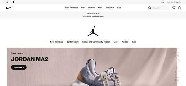
Sample of Clean Design
Nike has done a great job over the years keeping their large product line displayed in an organized fashion with clean landing pages for each of their product lines. In this example, we can see the “Jordan” product line as well as links back to their other products. They utilize grayscale on the web design to help make the products pop off the page and minimize the website elements.
